Food and Friends and Photography

Editor’s note: Recognizing that we can practice Franciscan values in all aspects of life and work, DC Service Corps volunteer Jarrett Murano practices humility by centering the desires of the client in his graphic design ministry at Food & Friends.
At Food & Friends, one of my current projects is to make postcards to reach out to clients. While brainstorming, I had a myriad of ideas of what direction to go. My main goal was simple: to make media that someone would want to be hung up. This idea comes from my own personal love of hanging up mail I have received, but I also know that appreciation of something in the mailbox is a shared experience. This goal was much more complex in practice.
During the development of concepts, I kept very meticulous notes of what I liked of the 30-some designs I accumulated. One theme was prevalent between all of them: I wanted to showcase the facilities and people that work at Food & Friends. I didn’t want to just rely on stock images. Those wouldn’t create successful designs because the work would have a lot of elements in it that just weren’t Food & Friends. This is where I started experimenting.
I was curious as to what photos might look good on the postcards. If they’re more artsy, would that be successful? What about a more default approach to photos? Ultimately I decided that I’d try the photos with a longer shutter. Longer shutters on cameras mean that the camera takes a longer time to take the photo, which is why the blur is more prominent. For you photography people reading this, my settings were 200 ISO, 3/5s shutter, f/6.3.
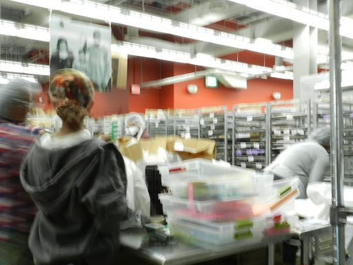
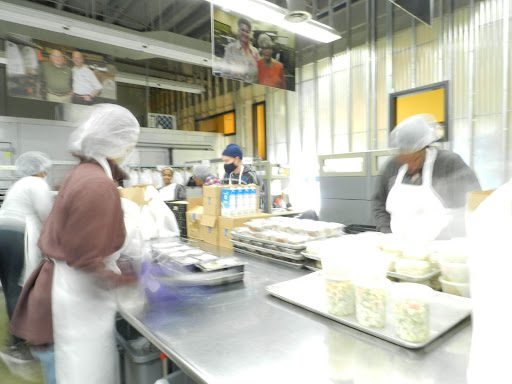

I chose to photograph the expo/packing area, where groceries and meals are prepared for transport to clients, for 2 distinct reasons. Firstly, it has the most motion. In a project based around capturing movement, packing makes the most sense. Secondly, packing is where it all comes together. Everything in Food & Friends is a collaborative effort, but groups of volunteers keep the expo/packing area in full tilt. The volunteers make the packing happen. I wanted to try to illustrate the visual collaboration between the workers at their stations as they packed the outgoing bags.
I think it was a successful shoot. I really like how the blur turned out, how the faces are obscured but the motion is there. I like how the colors are super bright, almost too bright, like there’s a light source at every conceivable angle. Unfortunately, in the end I found this series too artsy for the postcards. I think that they have potential to be used in upcoming projects, but I think that they leaned too much into the artsy field. They might be cool to some clients, but to the greater majority it might not make as much sense. I think that a more orthodox approach was needed for this specific project.
In graphic design, the goal is what the client wants. Usually that client is the person that hired you. In this case, I have been given most of the reins to create which makes the client the people we deliver to. It does not matter what I want, ultimately, because I am not making this project for me. The cards are for our clients, and if the concepts that I put hours into are not what people want, then that’s how it is. I create the works for them. Graphic design sounds pretty Franciscan actually. I wonder if St. Francis would have had a favorite typeface?
Question for reflection: What Franciscan values are you practicing through your work?
Tagged in: